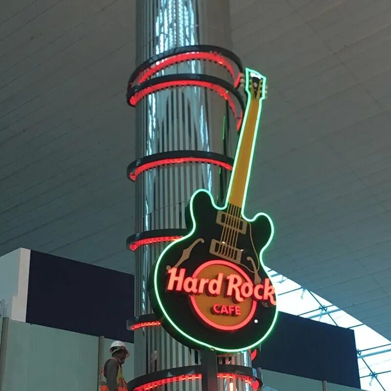
A business can invest heavily in its branding and still make a poor first impression with a badly designed sign. Faded colours, inconsistent lettering, cheap materials, poor lighting, and awkward placement can make even an established company look unprofessional. Worse, these mistakes can weaken brand recognition and affect how customers perceive the business.
Before investing in custom signage in Saudi Arabia, understand the design and production errors that can undermine your brand image and make your signage look far less impressive than intended.
Choosing the wrong materials
Cheap boards save money at first, but heat and sunlight make them warp, crack, or fade. Select materials that suit the location and lifespan. Aluminium, acrylic, and illuminated panels offer distinct benefits. Ask about thickness, weather resistance, finish, and maintenance. Durable surfaces protect brand presentation and reduce replacement costs over time.
Using too many fonts and colours
A sign communicates its message at a glance. Too many typefaces, bright shades, shadows, and effects make designs look confused. Choose one primary font and one supporting typeface. Keep brand colours consistent, maintain contrast, and leave empty space around wording. Strong visual order helps customers recognise the business quickly.
Ignoring size and readability
Artwork loses value when customers cannot read it. Tiny letters disappear at a distance; oversized graphics overwhelm a storefront. Consider viewing distance, traffic speed, mounting height, and nearby buildings. Test the design at full scale. Make the business name easy to recognise. Check letter spacing and contrast under actual site lighting.
Stretching or distorting the logo
A logo represents years of recognition. Stretching its proportions, changing its colours, or using a busy background damages its identity. Supply vector artwork and follow brand guidelines. Check spacing, alignment, and colour accuracy across signs and window graphics. Consistent logo use helps customers connect every location with the same brand.
Poor lighting and installation
Uneven illumination, exposed cables, loose fixings, and crooked panels make signage look careless. Match lighting to the setting and check daytime and evening visibility. Use suitable electrical components and secure mounting systems. Inspect surfaces, access limits, and safety concerns before fitting. Neat cable management also keeps the finished display clean.
Forgetting local context
Signage should suit its audience and surroundings. Check local regulations, language requirements, building guidelines, and landlord approvals. In Saudi Arabia, bilingual layouts help visitors read key information. Give Arabic and English balanced spacing and correct letterforms. Review translations with a fluent reader before sending artwork into production.